> ## Documentation Index
> Fetch the complete documentation index at: https://telr-docs.cashfree.com/llms.txt
> Use this file to discover all available pages before exploring further.
# Overview
> Learn about the components which are available with Cashfree.js
Once you have initialized the cashfree.js sdk you can use the create method to create a component
```javascript theme={null}
let cashfree = Cashfree({mode: "sandbox"});
let options = {};
let component = cashfree.create("componentName", options);
```
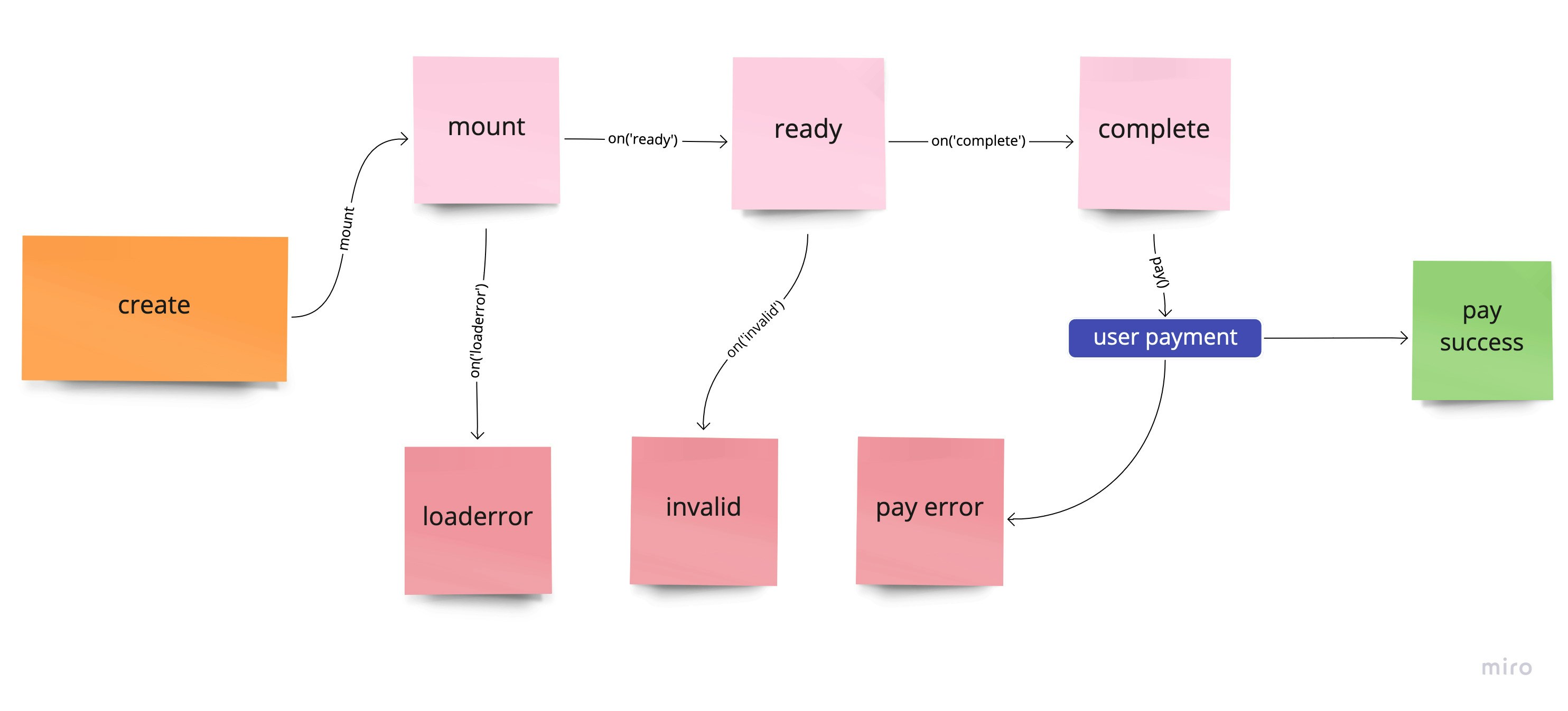
## Component Lifecycle
 ## Methods
### Mount component
A component can be mounted in DOM container
```
Syntax: `component.mount(querySelector)`
```
Example
```
component.mount("#componentContainer")
```
### Update component
The values of a component can be updated
```
Syntax: `component.update(values)`
```
Example
```
let values = {
keyName: "keyValue"
}
component.update(values)
```
### Unmount component
To unmount a component from DOM container. Use component.mount to mount again
```
component.unmount()
```
### Get component data
To get the data and state of a component
```
let data = component.data()
```
#### Returns
```
{
value: {},
error: undefined,
message: {},
invalid: undefined,
empty: true,
complete: false,
ready: false,
componentName: "componentName",
node: null,
mounted: false,
loaderror: false,
focus: false,
disabled: false,
kind: "string"
}
```
| Name | Description | Default |
| --------------- | ------------------------------------------------------ | --------------- |
| `value` | Contains the value of the component. | `{}` |
| `error` | Contains error that has occurred in the component | `undefined` |
| `message` | Contains any message that can be shown to the customer | `{}` |
| `invalid` | Is `true` is the component is invalid | `undefined` |
| `empty` | Is `true` if the component is empty | `false` |
| `complete` | Is `true` if the component is complete | `false` |
| `ready` | Is `true` if the component is ready for user input | `false` |
| `componentName` | Contains the type of the component | `componentName` |
| `node` | Contains the reference to the parent of the component | `null` |
| `mounted` | Is `true` if the component has been mounted | `false` |
### Blur component
Trigger blur on component. Can only be applied if `kind` of the component is `input`
```js theme={null}
component.blur()
```
### Focus component
Trigger focus on component. Can only be applied if `kind` of the component is `input`
```js theme={null}
component.focus()
```
### Clear component
Trigger clear on component to empty it. Can only be applied if `kind` of the component is `input`
```js theme={null}
component.clear()
```
### Click component
Trigger click on component. Can only be applied if `kind` of the component is `button`
```js theme={null}
component.click()
```
### Disable component
Disabling component will apply the `classes.disabled` and `style.base[":disabled"]` or `style.empty[":disabled"]` to the container and compoent respectively. Can be applied to `input` and `button`
```js theme={null}
component.disable()
```
### Enable component
To enable a disabled component. Can be applied to `input` and `button`
```js theme={null}
component.enable()
```
### Destroy component
To destroy a component. Once a component is destroyed it cannot be mounted again
```js theme={null}
component.destroy()
```
## Events
You can register a callback function to various events that occur with a component. The basic syntax is `component.on(eventName, callBackFunction)`
### ready
Triggers when a component is ready for user interaction
```js theme={null}
component.on('ready', function(data){
//data is same as component.data()
})
```
### focus
Triggers on component `kind` `input` when focussed
```js theme={null}
component.on('focus', function(data){
//data is same as component.data()
})
```
### blur
Triggers on component `kind` `input` when blurred
```js theme={null}
component.on('blur', function(data){
//data is same as component.data()
})
```
### invalid
Triggers on component `kind` `input` when value entered by the user is invalid. Callback receives object that has the error. Read more about error here
```js theme={null}
component.on('invalid', function(data){
//data is same as component.data()
//data.error has the actual error
//you can use data.error.message to show to customer
})
```
### change
Triggers on component `kind` `input` whenever change happens for the value
```js theme={null}
component.on('change', function(data){
//data is same as component.data()
})
```
### empty
Triggers on component `kind` `input` when empty
```js theme={null}
component.on('empty', function(data){
//data is same as component.data()
})
```
### complete
Triggers on component `kind` `input` when value entered is complete and valid
```js theme={null}
component.on('complete', function(data){
//data is same as component.data()
})
```
### click
Triggers on component `kind` `button` when clicked
```js theme={null}
component.on('click', function(data){
//data is same as component.data()
})
```
### paymentrequested
Triggers on component payable components when payment has been successfully initiated
```js theme={null}
component.on('paymentrequested', function(data){
//data is same as component.data()
})
```
### loaderror
Triggers on component which could not be mounted. Callback receives object that has the error. Read more about error here
```js theme={null}
component.on('loaderror', function(data){
//data is same as component.data()
//data.error has the actual error
//you can use data.error.message to show to customer
})
```
## Methods
### Mount component
A component can be mounted in DOM container
```
Syntax: `component.mount(querySelector)`
```
Example
```
component.mount("#componentContainer")
```
### Update component
The values of a component can be updated
```
Syntax: `component.update(values)`
```
Example
```
let values = {
keyName: "keyValue"
}
component.update(values)
```
### Unmount component
To unmount a component from DOM container. Use component.mount to mount again
```
component.unmount()
```
### Get component data
To get the data and state of a component
```
let data = component.data()
```
#### Returns
```
{
value: {},
error: undefined,
message: {},
invalid: undefined,
empty: true,
complete: false,
ready: false,
componentName: "componentName",
node: null,
mounted: false,
loaderror: false,
focus: false,
disabled: false,
kind: "string"
}
```
| Name | Description | Default |
| --------------- | ------------------------------------------------------ | --------------- |
| `value` | Contains the value of the component. | `{}` |
| `error` | Contains error that has occurred in the component | `undefined` |
| `message` | Contains any message that can be shown to the customer | `{}` |
| `invalid` | Is `true` is the component is invalid | `undefined` |
| `empty` | Is `true` if the component is empty | `false` |
| `complete` | Is `true` if the component is complete | `false` |
| `ready` | Is `true` if the component is ready for user input | `false` |
| `componentName` | Contains the type of the component | `componentName` |
| `node` | Contains the reference to the parent of the component | `null` |
| `mounted` | Is `true` if the component has been mounted | `false` |
### Blur component
Trigger blur on component. Can only be applied if `kind` of the component is `input`
```js theme={null}
component.blur()
```
### Focus component
Trigger focus on component. Can only be applied if `kind` of the component is `input`
```js theme={null}
component.focus()
```
### Clear component
Trigger clear on component to empty it. Can only be applied if `kind` of the component is `input`
```js theme={null}
component.clear()
```
### Click component
Trigger click on component. Can only be applied if `kind` of the component is `button`
```js theme={null}
component.click()
```
### Disable component
Disabling component will apply the `classes.disabled` and `style.base[":disabled"]` or `style.empty[":disabled"]` to the container and compoent respectively. Can be applied to `input` and `button`
```js theme={null}
component.disable()
```
### Enable component
To enable a disabled component. Can be applied to `input` and `button`
```js theme={null}
component.enable()
```
### Destroy component
To destroy a component. Once a component is destroyed it cannot be mounted again
```js theme={null}
component.destroy()
```
## Events
You can register a callback function to various events that occur with a component. The basic syntax is `component.on(eventName, callBackFunction)`
### ready
Triggers when a component is ready for user interaction
```js theme={null}
component.on('ready', function(data){
//data is same as component.data()
})
```
### focus
Triggers on component `kind` `input` when focussed
```js theme={null}
component.on('focus', function(data){
//data is same as component.data()
})
```
### blur
Triggers on component `kind` `input` when blurred
```js theme={null}
component.on('blur', function(data){
//data is same as component.data()
})
```
### invalid
Triggers on component `kind` `input` when value entered by the user is invalid. Callback receives object that has the error. Read more about error here
```js theme={null}
component.on('invalid', function(data){
//data is same as component.data()
//data.error has the actual error
//you can use data.error.message to show to customer
})
```
### change
Triggers on component `kind` `input` whenever change happens for the value
```js theme={null}
component.on('change', function(data){
//data is same as component.data()
})
```
### empty
Triggers on component `kind` `input` when empty
```js theme={null}
component.on('empty', function(data){
//data is same as component.data()
})
```
### complete
Triggers on component `kind` `input` when value entered is complete and valid
```js theme={null}
component.on('complete', function(data){
//data is same as component.data()
})
```
### click
Triggers on component `kind` `button` when clicked
```js theme={null}
component.on('click', function(data){
//data is same as component.data()
})
```
### paymentrequested
Triggers on component payable components when payment has been successfully initiated
```js theme={null}
component.on('paymentrequested', function(data){
//data is same as component.data()
})
```
### loaderror
Triggers on component which could not be mounted. Callback receives object that has the error. Read more about error here
```js theme={null}
component.on('loaderror', function(data){
//data is same as component.data()
//data.error has the actual error
//you can use data.error.message to show to customer
})
```